
In an effort to continue producing highly-detailed documentation for Unqork Creators, the Documentation Hub has undergone some changes. These changes were made to improve user experience and allow for easier navigation of the documentation.
In addition to the changes to the site, ongoing updates to the look and feel of our documents are taking place. With the new component UI changes, you’ll find the documentation more intuitive and more representative of what you see when configuring modules.
What Changed
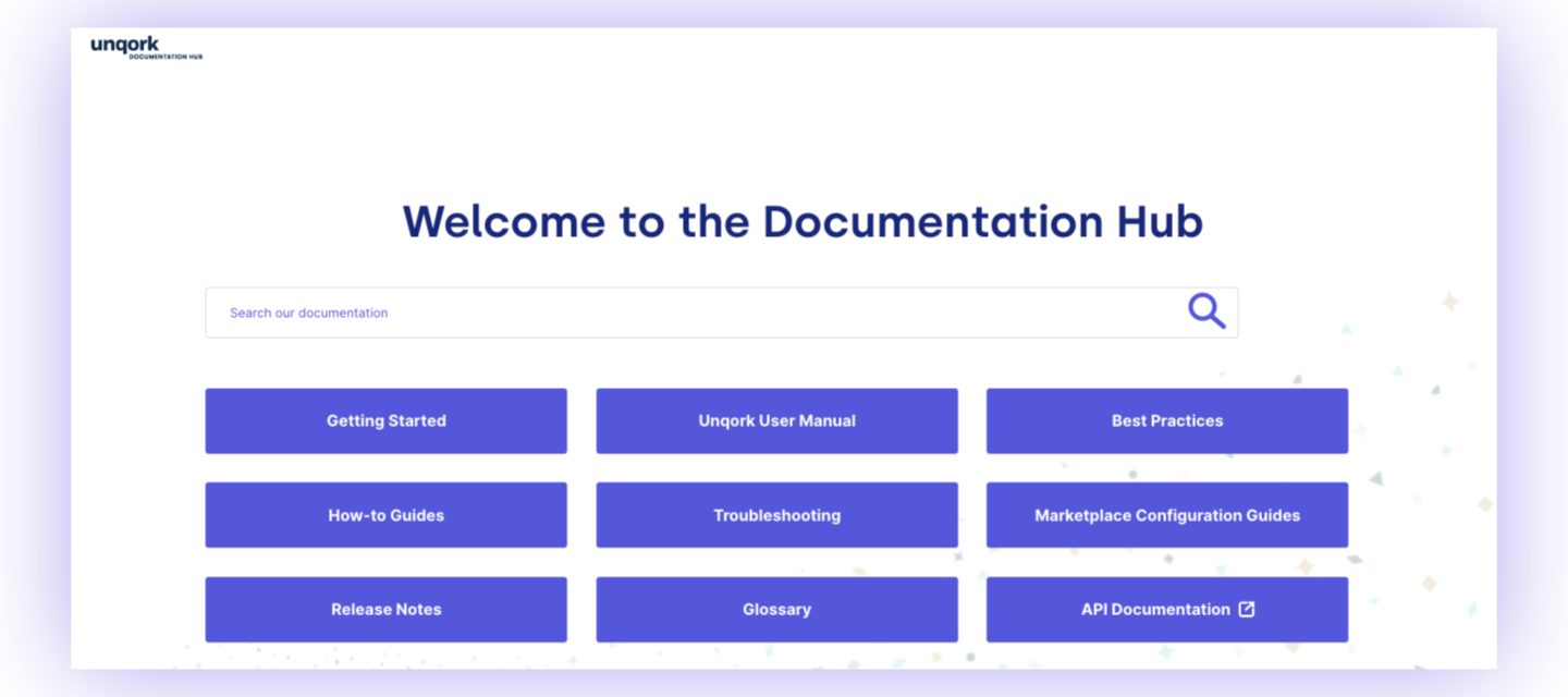
Documentation Hub
-
Improved Search: While we continue to improve our search engine, an industry-standard documentation site should not be dependent on it. You’ll find a completely restructured side navigation for the different buckets of our site. This includes alphabetized organization, and lower-level documentation moved to top-level sections. These changes make it easier to locate documentation based on topic, and minimize clicking.
Documentation Hub articles remain accessible within our Community Hub search:
-
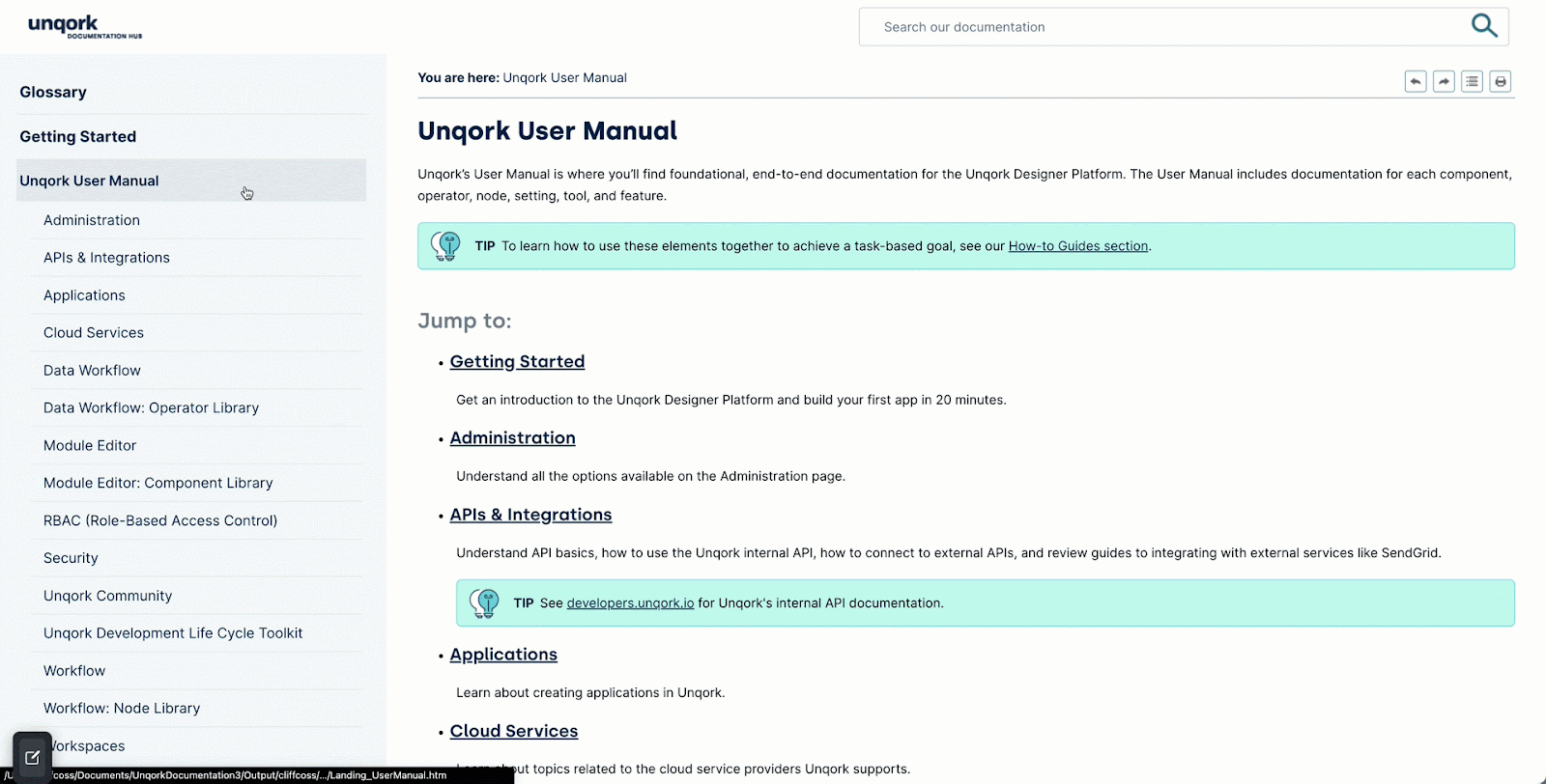
New Landing Pages: We’ve also created new landing pages for all top-level sections of the side-nav. These landing pages provide brief descriptions of the lower-level documentation in that section and include direct links. For example, check out the Table Operators section of the Data Workflow: Operator Library in our User Manual.
-
New How-to Organization: All How-to guides are now housed in the How-to Guides section, with new landing pages explaining each guide of that section. For example, check out the Module Editor: Component Library section of our How-to Guides.
-
Improved Navigation: With the new UI changes to components, use the side-nav to navigate the article itself better. This change reduces scrolling and allows everyone to use the Doc Hub as it was intended: as a true reference site to find the exact information you are looking for. For example, check out the new and improved Panel and Text Field component articles.
Component Articles
-
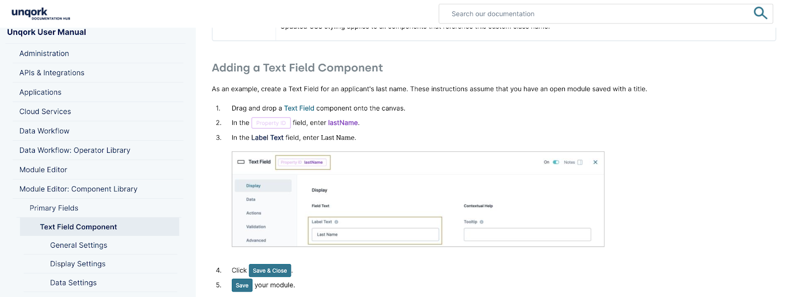
With the new look and feel of components, we made documentation changes to match the UI.
-
Tables now look identical to the tables you would see in the actual component settings.
-
Updated images that display the new component settings.
-
In our step-by-step procedures, you’ll see new text colors that match the component. For example, Property ID and Label Text colors.
-
As you proceed through the step-wise procedures, hover over the settings we ask you to configure to display descriptions. This change keeps you on task and minimizes the need to scroll back to the settings portion of the doc. For example, hover over the Property ID in step 2 of the Text Field component article.
-
Instead of bold text for steps like “Click Save & Close” and “Save your module”, you’ll now see this text as the actual button you would click in the component. While these changes appear as images, they are still compatible with any customers that need to use a translation tool, like Google Translate.
Documentation Requests
We value your feedback. Reply below with your comments, or consider submitting your documentation ideas and requests here on Community Hub.
Learn how: